Franconeri et al. 2021
2024-04-02 lab meeting
Preliminary
Franconeri, S. L., Padilla, L. M., Shah, P., Zacks, J. M., & Hullman, J. (2021). The science of visual data communication: What works. Psychological Science in the Public Interest: A Journal of the American Psychological Society, 22(3), 110–161. https://doi.org/10.1177/15291006211051956.
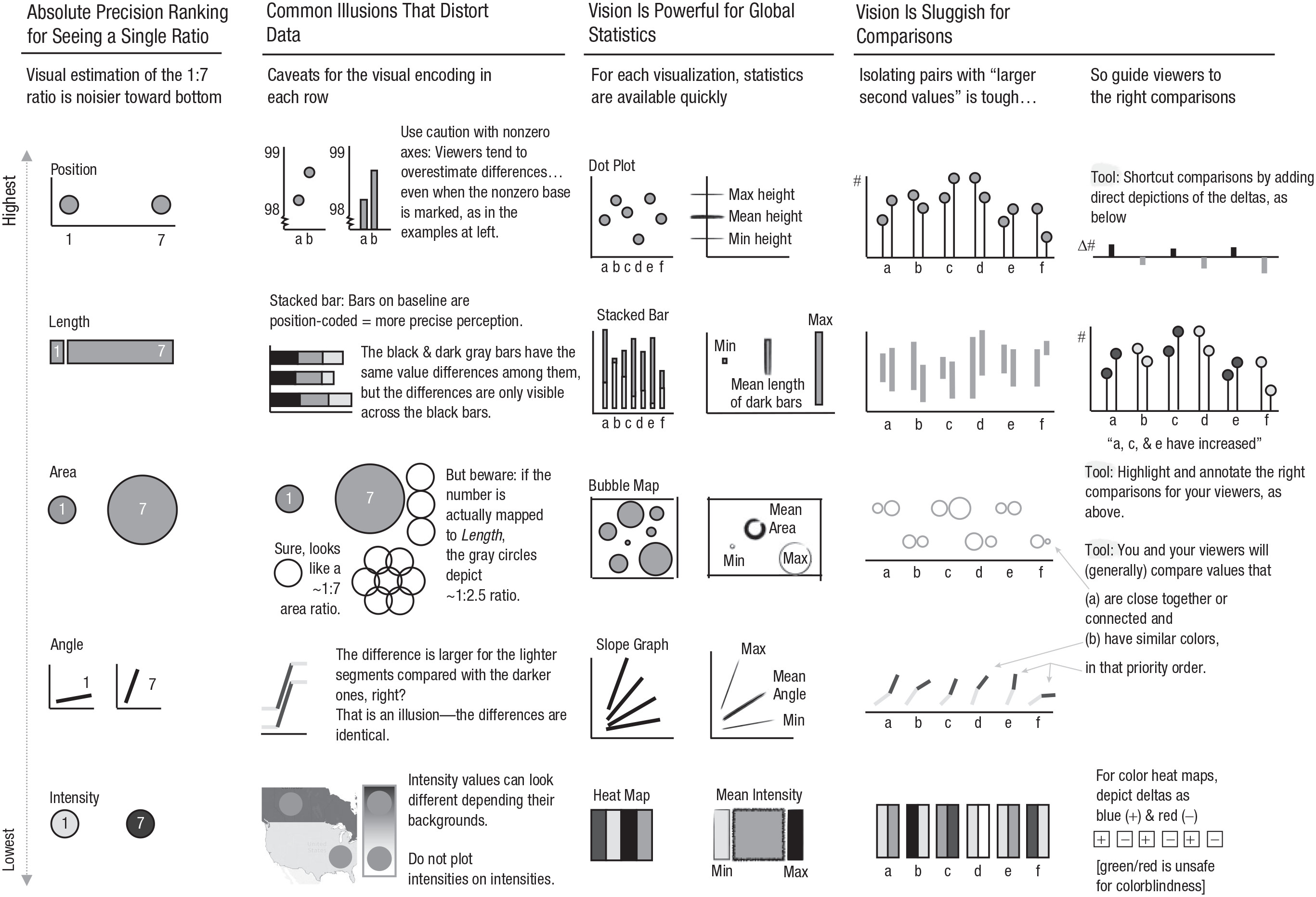
(Figure 1 from Franconeri et al. 2021)
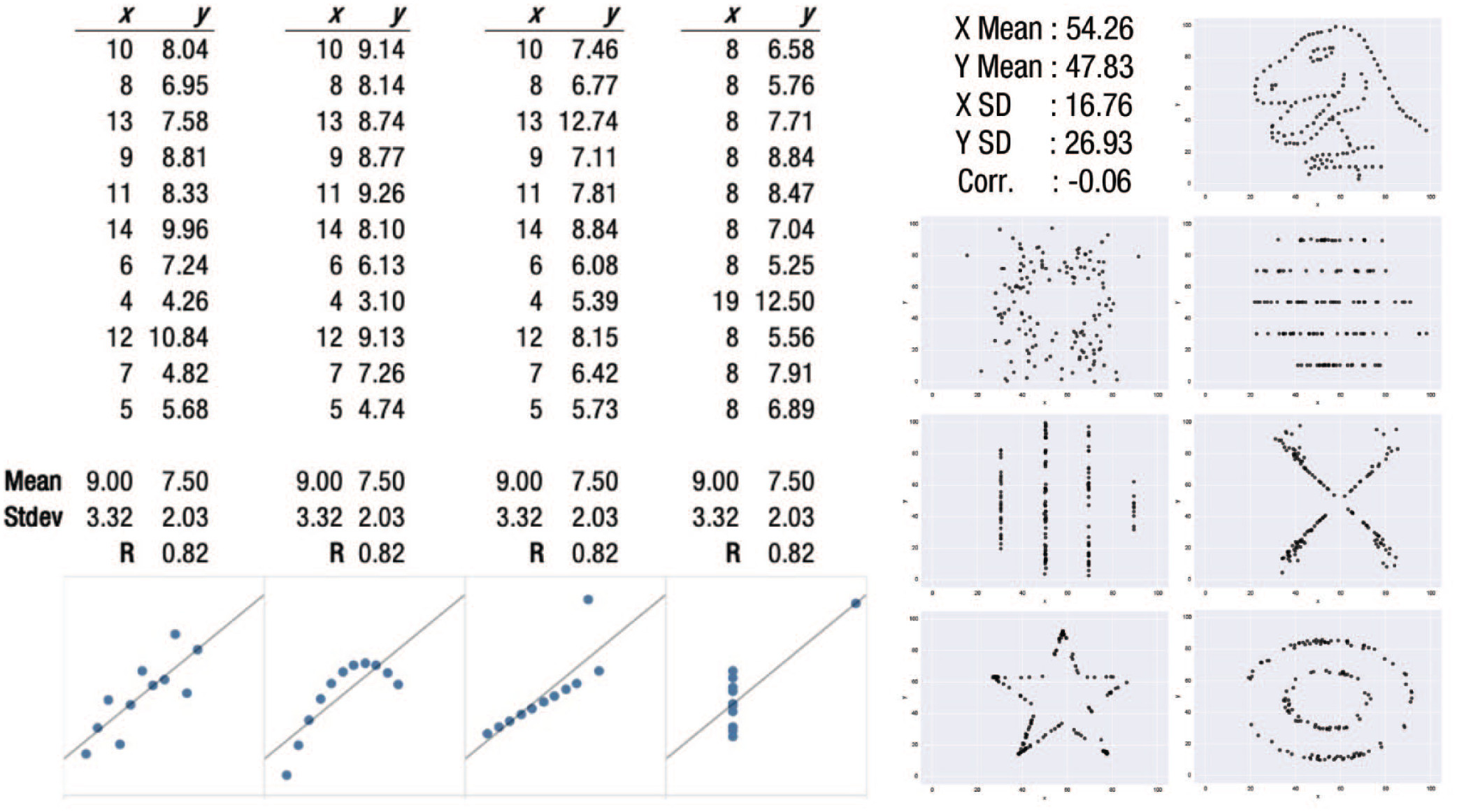
Datasaurus Dozen
(“The Datasaurus Dozen - Same Stats, Different Graphs | Autodesk Research,” n.d.; Autodesk Research 2017)
Take homes
- Statistics can mislead
- Plot your data!
Visual dimensions for representing quantity
- Position
- Length
- Area
- Angle
- Intensity
Student-suggested examples


Take homes
- Plots can also mislead
Resources
Code
These slides were made using Quarto and rendered to HTML using the RevealJS framework.
References
(Figure 2 from Franconeri et al. 2021). Fig. 2. A summary of the power and limits of visual data processing. The two columns on the left show a quick reference guide to channels that can depict data visually and common illusions for each channel. The column in the center presents a summary of how visual statistics are powerful. The two columns on the right illustrate how comparisons are severely limited and present a set of design techniques that focus viewers on the “right” ones.
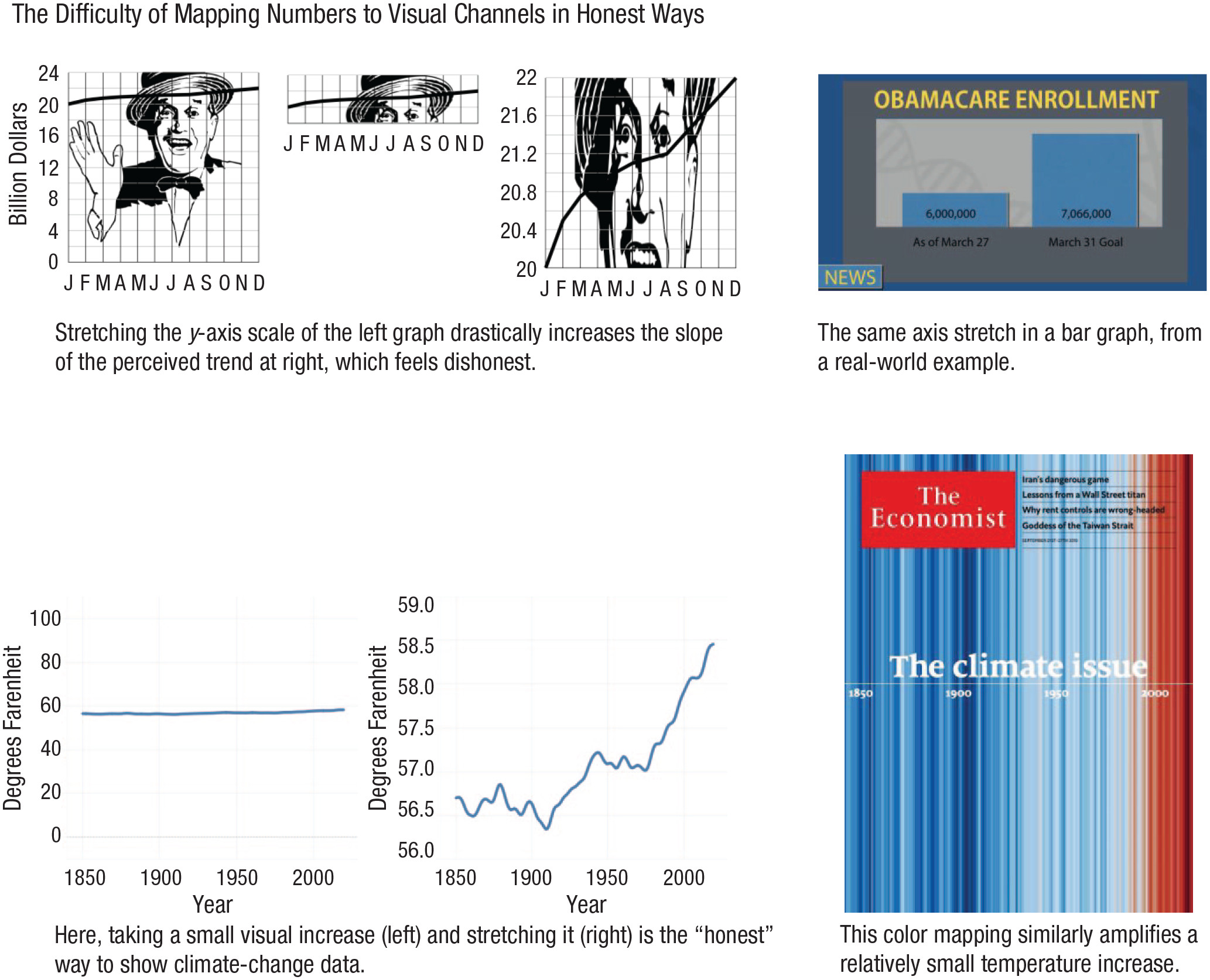
(Figure 3 from Franconeri et al. 2021). Fig. 3. Deceptive axis manipulations across a line graph (top left) and a bar graph (top right). So, should data always be plotted relative to zero? The graph on the bottom left depicts climate change by plotting temperature data from a baseline of 0 °F, yet most would agree that graph is less informative than the version to its right, which allows the differences in temperatures to be seen. At the bottom right of the figure, a cover of The Economist from September 2019 maps the same restricted range of data to the full range of a blue-to-red color scale. The graphs at top left are inspired by Huff (1954); those at bottom left are inspired by Correll et al. (2020). The magazine cover at bottom right is reprinted, with permission, from The Economist (September 19, 2019).
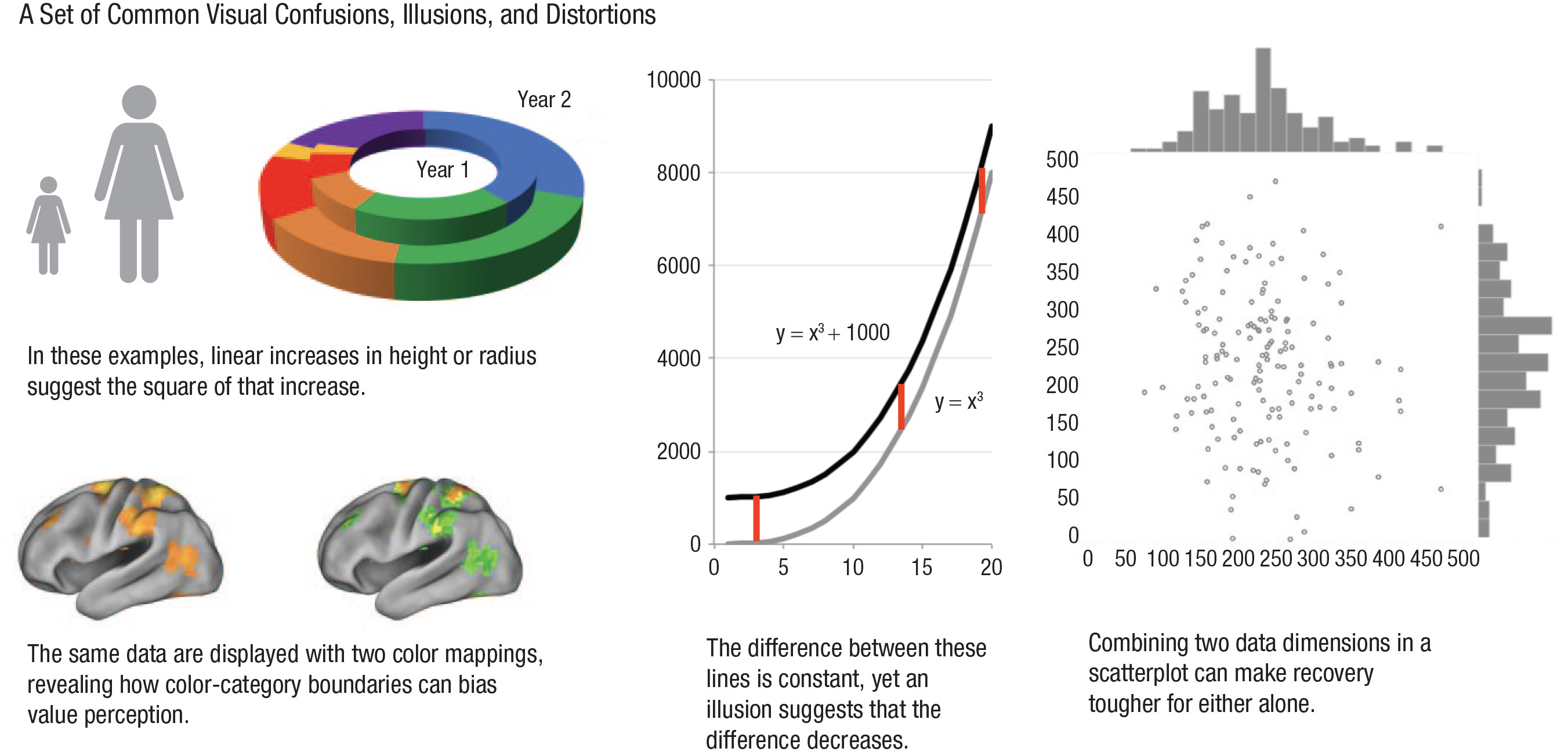
(Figure 4 from Franconeri et al. 2021). Fig. 4. A set of common visual confusions, illusions, and distortions. At upper left, the two human icons represent vastly different ratios depending on whether the data are represented by their one-dimensional heights, their two-dimensional areas, or their three-dimensional volumes. The donut graph to their right shows that three-dimensional depictions can artificially inflate data values in the two-dimensional plane. At bottom left, the same fMRI data are plotted with two color mappings. The brain image on the left produces less of a spurious categorical boundary effect, whereas the image on the right shows a common red-to-green color map that makes continuous variation appear exaggerated when it maps onto transitions from one color category to another. At center, an illusion prohibits the accurate recovery of differences between values in a line graph. At right, correlation is easier to detect from the scatterplot, but individual histograms for each dimension are easier to see when plotted separately.
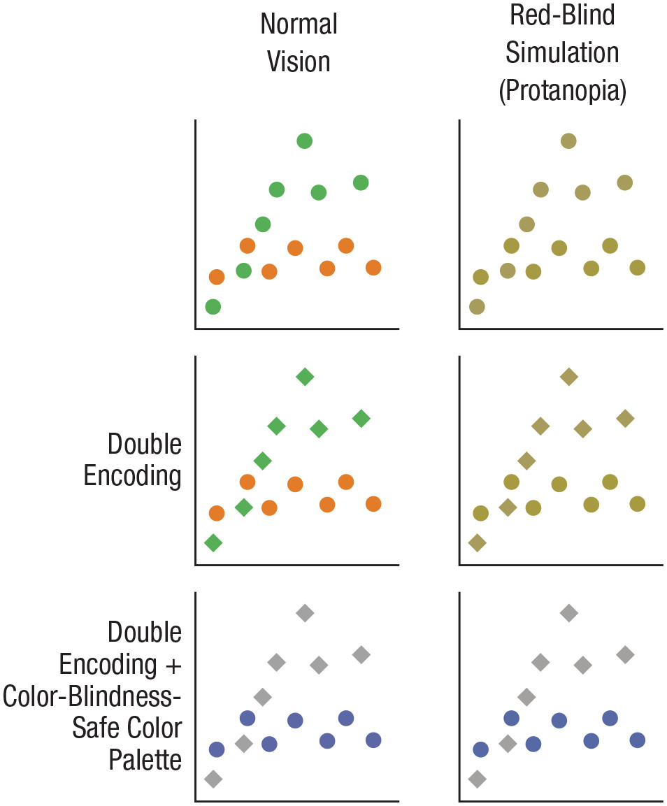
(Figure 5 from Franconeri et al. 2021). Fig. 5. Three ways to encode data for two groups in a scatterplot, as seen by observers with typical color perception and those with protanopia, a form of color blindness. Protanopia was simulated in Photoshop.
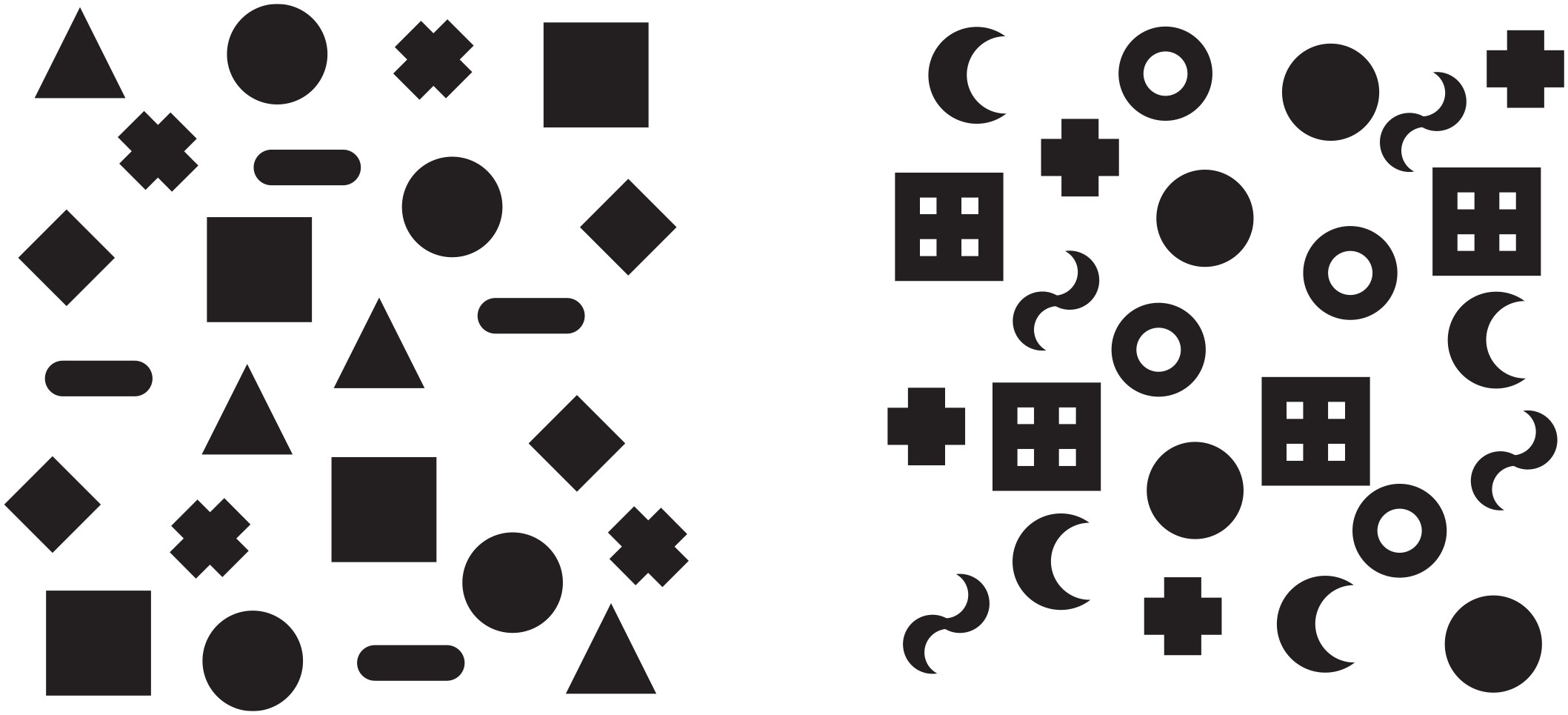
(Figure 6 from Franconeri et al. 2021). Fig. 6. The standard shape set for Microsoft Excel (left) compared with a perceptually spaced set (right; inspired by Huang, 2020). Try to pick out the four instances of each shape in each display—you should find that task easier on the right side.
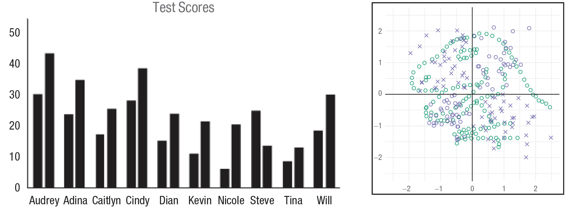
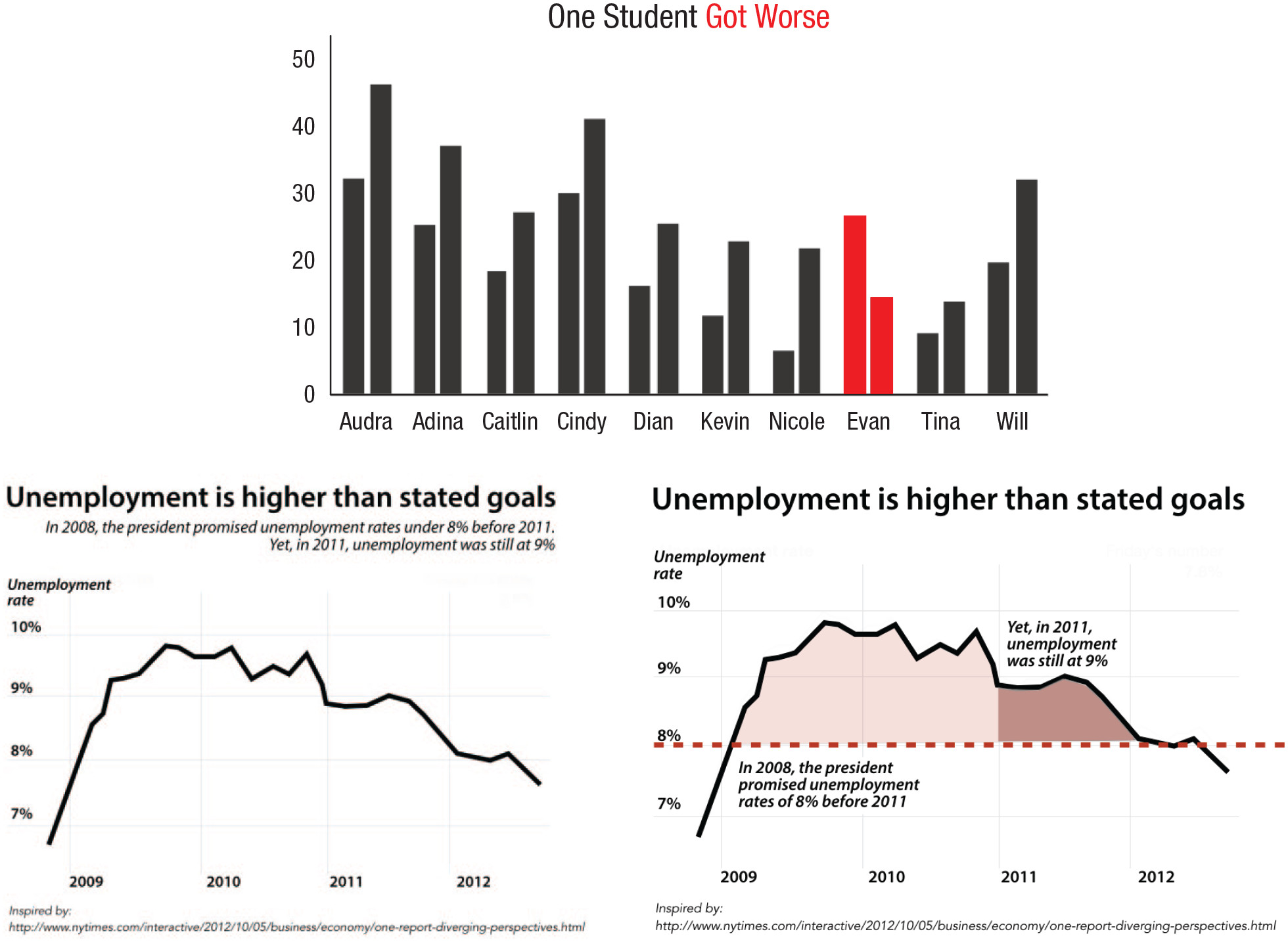
(Figure 7 from Franconeri et al. 2021). Fig. 7. Visual comparison as a serial process. In the bar graph on the left, which student has a second bar that is lower than the first? To find the answer, the viewer needs to process each set of bars individually, rather than all at once. On the right, viewers tasked with processing the blue set of marks failed to notice the dinosaur shape created by the green set of marks. The image on the right is reprinted from Boger et al. (2021).
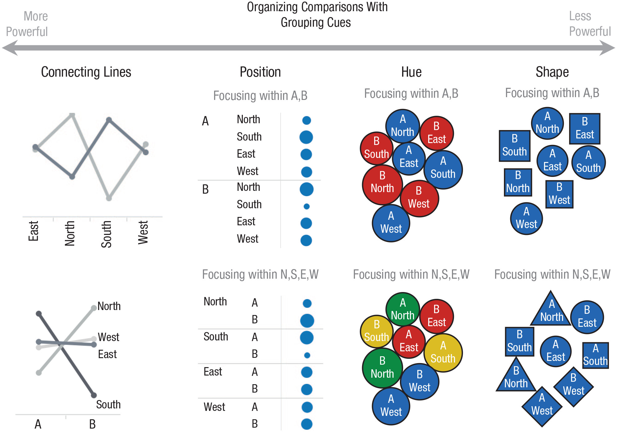
(Figure 8 from Franconeri et al. 2021). Fig. 8. Several grouping cues that can control how data values are compared. Connecting lines are particularly powerful cues, followed by proximity, color, and shape (Brooks, 2015).
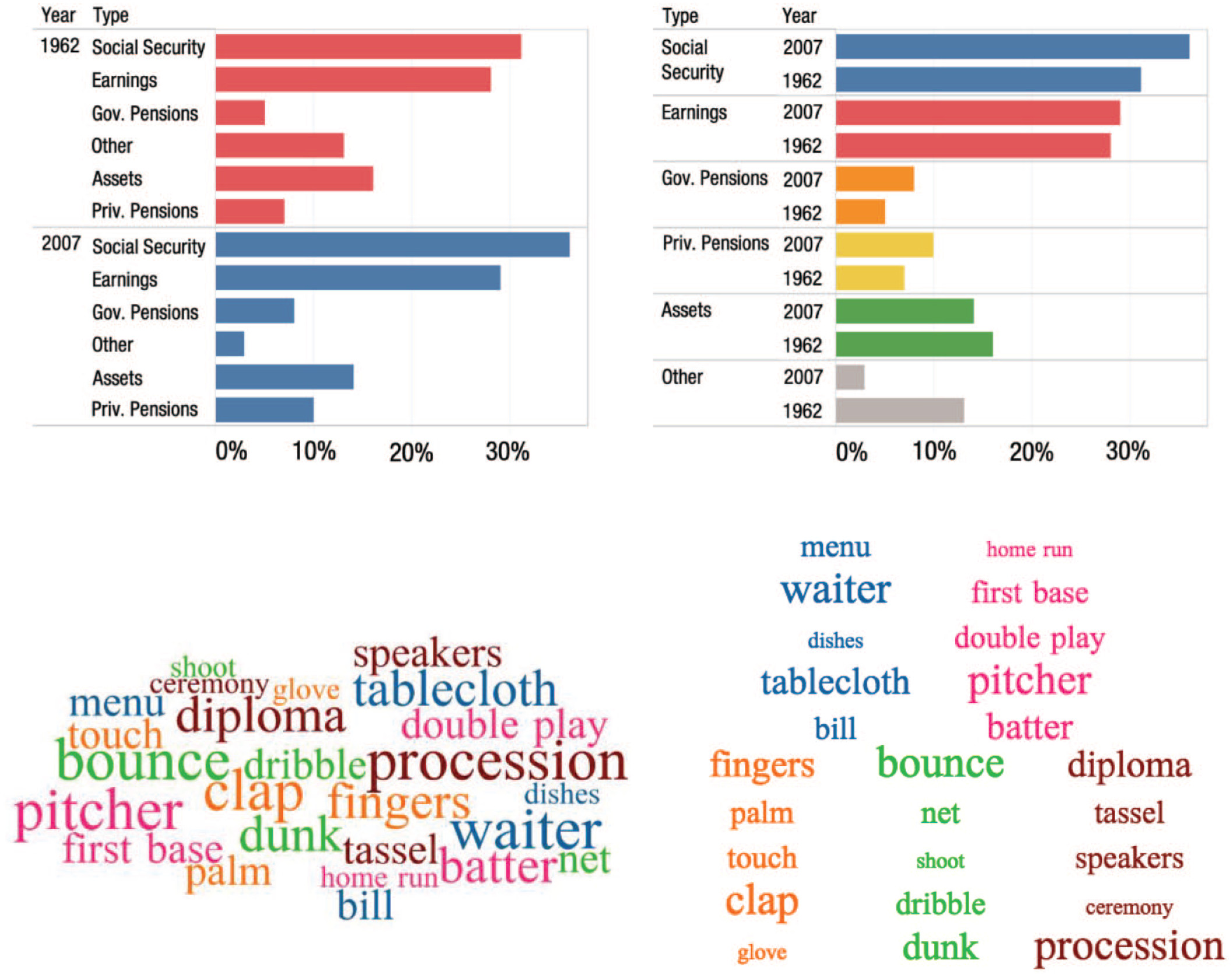
(Figure 9 from Franconeri et al. 2021). Fig. 9. How visual grouping cues can control visual comparison. At top, a combination of color and proximity grouping lead the viewer to different visual comparisons across the two bar graphs. At the bottom, comparisons in a word cloud are weakly controlled by color grouping, and more strongly controlled with proximity grouping.
(Figure 10 from Franconeri et al. 2021). Fig. 10. Color highlighting and direct annotation to help viewers make the right comparison first and know what conclusion is supported by that pattern in the data. The graphic at the top illustrates a color-highlighting technique suggested in business-oriented practitioner guides (e.g., Knaflic, 2015). The graphs at the bottom (inspired by Bostock et al., 2012) are an adaptation of a graph by data journalists using grouping, highlighting, and verbal annotation.
Autodesk Research. 2017. “Same Stats, Different Graphs - CHI 2017.” Youtube. https://www.youtube.com/watch?v=DbJyPELmhJc.
Franconeri, Steven L, Lace M Padilla, Priti Shah, Jeffrey M Zacks, and Jessica Hullman. 2021. “The Science of Visual Data Communication: What Works.” Psychological Science in the Public Interest: A Journal of the American Psychological Society 22 (3): 110–61. https://doi.org/10.1177/15291006211051956.
Lee, Helena, Ravi Purohit, Aarti Patel, Eleni Papageorgiou, Viral Sheth, Gail Maconachie, Anastasia Pilat, Rebecca J McLean, Frank A Proudlock, and Irene Gottlob. 2015. “In Vivo Foveal Development Using Optical Coherence Tomography.” Investigative Ophthalmology & Visual Science 56 (8): 4537–45. https://doi.org/10.1167/iovs.15-16542.
“The Datasaurus Dozen - Same Stats, Different Graphs | Autodesk Research.” n.d. https://www.autodeskresearch.com/publications/samestats. https://www.autodeskresearch.com/publications/samestats.
